Peaks Only with AI Tools option
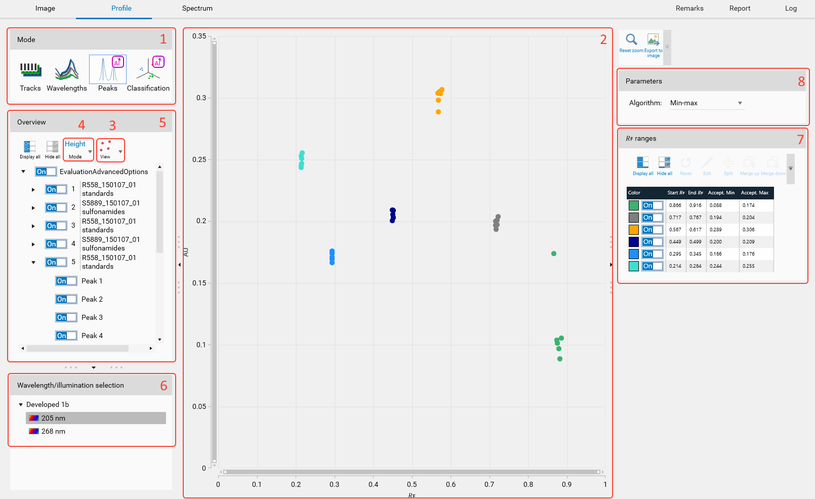
Use the Peaks mode to identify substances which are not well known and to quantify their acceptance ranges.
The data are displayed in a plot.
The plot will be either a scatter or a box plot depending on the selected view.
Each point represents a peak height or area (depending on the selected mode).
The peaks are grouped by tracks, analyses and filtered by the selected wavelength.
In the Wavelength/Illumination selection groupbox, the available wavelengths/illuminations allow to select the one to work with.
Since the peaks are not located exactly at the same 𝑅ꜰ, they are aggregated into ranges. The ranges are displayed on the right side, in the “𝑅ꜰ ranges” groupbox and can be manually edited.
The parameters of the algorithm calculating the acceptance limits and depending on the selected mode can be adjusted. The table shows the results for each range.
Selection and display
Once an illumination is selected in the lower side, the available peaks are displayed in the Overview groupbox.
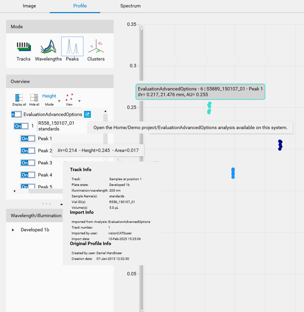
Several tooltips are available to provide useful information:
For the analysis, a button allows the user to open the corresponding analysis in a new pane.
For the track, details such as sample and import information are displayed.
For the peak, 𝑅ꜰ and AU values are displayed.
On the plot, a tooltip is also available when hovering over a point to identify the peak (track, analysis and recall the 𝑅ꜰ and AU values).
𝑅ꜰ ranges table
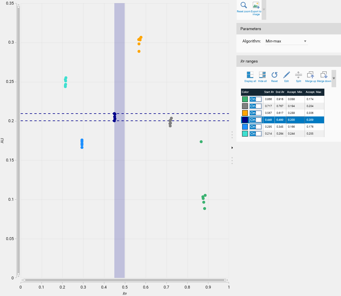
As the peaks are not exactly located at the same 𝑅ꜰ from one plate to another one, they are grouped by range. At first, the system computes ranges from a range of 0.05 𝑅ꜰ: Note that the ranges for both Height and Area types can be different. The selected range is highlighted both in the plot and in the table (vertical colored rectangle in the plot + highlighted row in the table).
The table provides the acceptance values for each range.
Available tools:
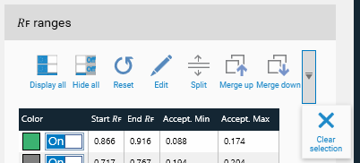
Display all peak ranges (so all the peaks) of the plot.
Hide all the peak ranges of the plot.
Reset the peak ranges (after user confirmation).
Edit the 𝑅ꜰ bounds of the peak range. The bounds should not be lower than the Start 𝑅ꜰ of the previous range and higher than the End 𝑅ꜰ of the next range. For first/last range, 0.0/1.0 bounds is checked.
Create a new range by splitting the selected one at a specific 𝑅ꜰ value. After the split, the plot and the acceptance values are updated.
Merge the selected range with the next one. After the merge, the plot and the acceptance values are updated.
Merge the selected range with the previous one. After the merge, the plot and the acceptance values are updated.
Clear the selection.
Scatter plot
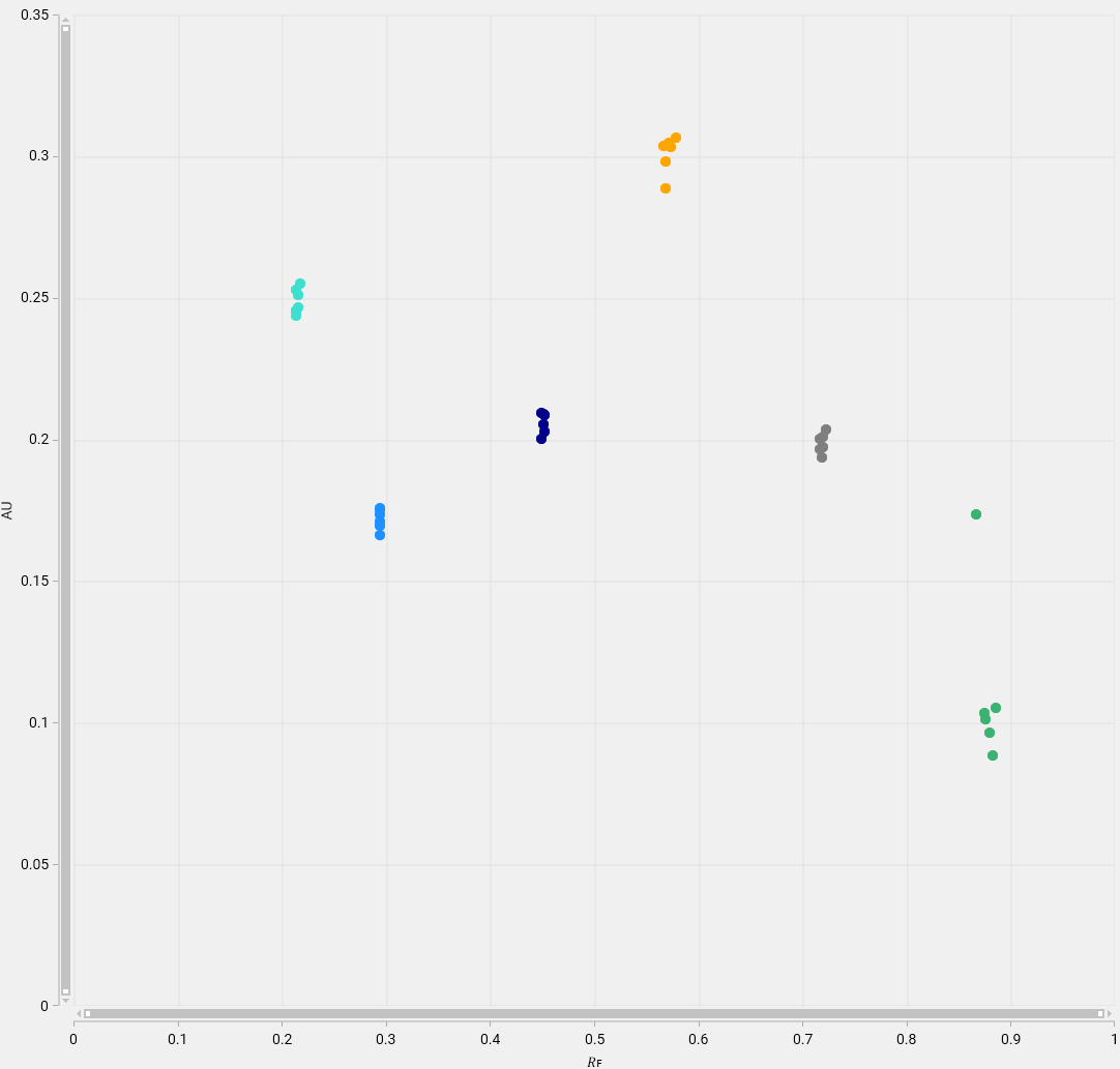
The scatter plot shows the data (peak height or peak area) with:
an horizontal linear axis representing the 𝑅ꜰ value;
a vertical linear axis representing the max height or area value.
The color of the points corresponds to the one of the 𝑅ꜰ range in the table.
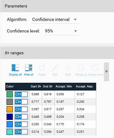
The Accept. Min and Accept. Max columns values are depending on the acceptance algorithm selected in the Parameters group box:
The Min Max algorithm simply set the Acceptance Min and Acceptance Max as the minimal and max values from the range.
The Confidence Interval (CI) algorithm refers to the probability that a population parameter will fall between a set of values for a certain proportion of times. Analysts often use confidence intervals that contain 95% of expected observations. 95% is the default parameter (other available values: 85%, 90% or 99%).
The CI algorithm is used as follows: First, the standard error is calculated:
\(SE=\frac{σ}{\sqrt{n}}\)
Where:
SE is the standard error;
σ is the standard deviation;
n is the number of points.
Then the Margin of error is estimated:
\(ME = SE x Z(CL)\)
Where:
ME is the margin of error
SE is the standard error
Z(CL) is the z-score confidence level (depending on the selected parameter). The z-score is given by statistical tables:
85%: 1.439531
90%: 1.644854
95%: 1.959964
99%: 2.575829
Finally, the upper and lower bounds are calculated:
\(Acceptance Min = mean - ME\)
\(Acceptance Max = mean + ME\)
Box plot
The box plot (also called box-and-whisker plot because of the possible presence of the lines extending from the box) allows to display a summarized information containing five values:
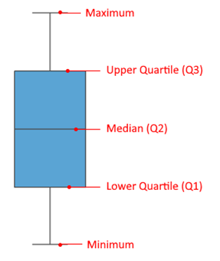
Minimum: the lowest data in the data set (excluding any outliers if the parameter is selected – detailed below)
Maximum: the highest data in the data set (excluding any outliers if the parameter is selected – detailed below)
Median: the middle value in the dataset (not necessary the mean!)
Lower Quartile (Q1): the median of the lower half of the data set.
Upper Quartile (Q3): the median of the upper half of the data set.
The distance between the upper and lower quartiles is another important element that can be used to obtain the box plot and is called the interquartile range (IQR).
\(IQR = Q3 - Q1\)
This type of view is useful to demonstrate graphically the locality, spread and skewness groups of data through their quartiles.
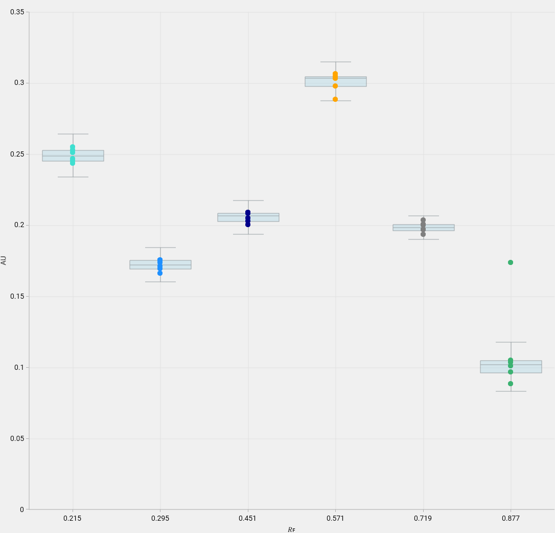
The box plot shows the data (peak height or peak area) with:
an horizontal non-linear axis representing the 𝑅ꜰ value,
a vertical linear axis representing the max height or area value.
The color of the points corresponds to the one of the 𝑅ꜰ range in the table.
Note
Unlike the scatter plot, the points are aligned horizontally because the horizontal axis is non-linear and therefore the RF value cannot be represented.
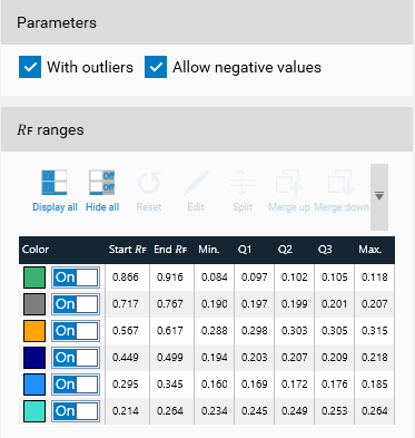
The box plot can be built with or without outliers. With outliers means that some data can be excluded from the plot because they are larger than 1.5 IQR plus the third quartile or smaller than 1.5 IQR minus the first quartile. Without outliers means that the minimum is the smallest data value and the maximum is the largest data value. Also, depending on the data as the boxplot can expose negative values, which could be inconsistent. Therefore, it is possible to force the values to be bound at minimal 0.
The table presents the values calculated for the boxplot; it is then possible to choose the most relevant quartiles for the acceptance criteria.
Usage in the limit tests
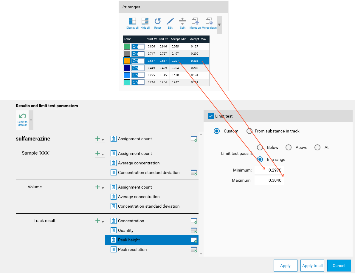
The acceptance values determined in this mode can then be (manually) used in the Limit tests.