Multi-Class Classification: Interpreting Training Quality Charts
This guide helps you interpret the performance of your model training using:
Training Loss Curve (for multi-layer perceptron)
Learning Curve (for random forest)
Confusion Matrix
Classification Report
By examining these visual and statistical diagnostics, you can distinguish between well-trained (good) and poorly trained (bad) models.
Interpretation of the Charts
Training Loss Curve (only for multi-layer perceptron)
The training loss curve illustrates the loss value over training iterations. It helps to visualize the convergence of the model during training.
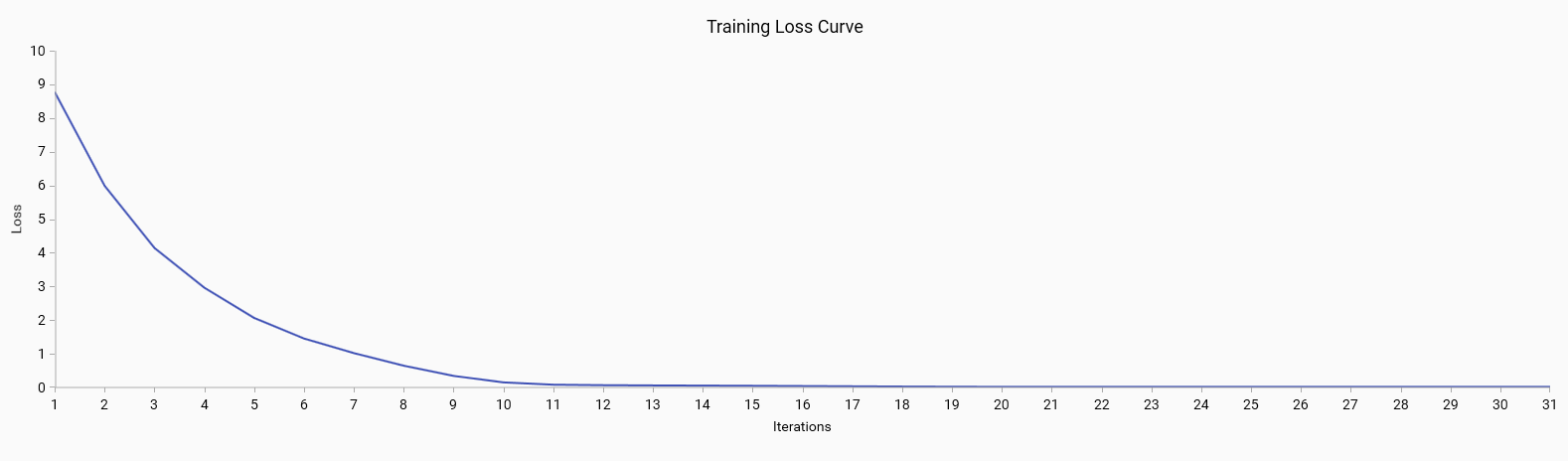
Good: A steadily decreasing loss that plateaus indicates that the model is learning effectively and converging to a solution.
Bad: A loss curve that fluctuates or does not decrease may indicate issues with the learning process, such as a high learning rate or model instability.
Learning Curve (only for random forest)
The learning curve shows the relationship between the training set size and model performance. It includes:
Training Score: The accuracy of the model on the training data. A high training score is generally good, but if it is significantly higher than the cross-validation score, it may indicate overfitting.
Cross-Validation Score: The accuracy of the model on the validation data. A high cross-validation score indicates good model performance on unseen data.
Error Bands: Represent the variability of the cross-validation scores. Narrow error bands are good as they indicate consistent model performance across different subsets of data.
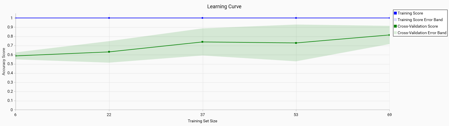
Good: Both the training and cross-validation scores are high and converge as the training set size increases. This indicates that the model generalizes well to unseen data.
Bad: A large gap between the training and cross-validation scores or wide error bands suggests overfitting or high variance in model performance.
Confusion Matrix
The confusion matrix provides a detailed breakdown of the model’s predictions versus the actual classes. Each row represents the true class, and each column represents the predicted class. In the matrix, only the diagonal values are highlighted in green, indicating correct predictions. Misclassifications are marked in red, showing where the model has incorrectly identified the class. Outside of the diagonal, a value of 0 is whited out, as it is the expected value for non-confusion between different classes.
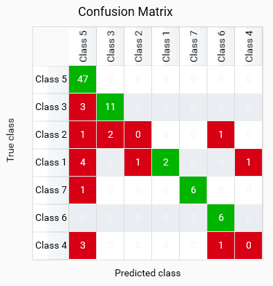
This model shows good classification for most classes, but BAN and BLA are misclassified as other classes, which may indicate a lack of training data for these classes or an issue with the model’s ability to learn those classes. BAS and BAM have some misclassifications, it can either be due to the model’s inability to distinguish between these classes or wrong training data for these classes.
Note
The confusion matrix calculated from cross-validated predictions (Leave-One-Out, LOO, is used here) can differ from a confusion matrix you will get when scoring with the final model trained on all data.
LOO produces out-of-sample predictions (each held-out sample is predicted by a model that never saw it) so its matrix is an honest but often noisier estimate. The final model is trained on every sample and may predict those same samples differently (often more correctly), which makes the final-model confusion matrix appear optimistically better.
Why this happens:
LOO predictions are out-of-sample and can misclassify hard or underfitted samples.
- Final-fit predictions are in-sample (the model saw the samples during training) and frequently
change to the (sometimes overly) correct class.
- Small / imbalanced classes: LOO estimates are unstable for rare classes and can exaggerate
misclassification rates for small groups.
Note
Why the cross-validated confusion matrix is displayed instead of the final-model matrix trained on all samples:
The LOO matrix gives an out-of-sample, less biased estimate of how the model generalizes to unseen data. For model selection and assessing real-world performance it is preferable because it avoids the optimistic bias of in-sample (final-fit) predictions. LOO is especially useful for small datasets where a single misclassified sample can strongly affect metrics and where a final model often “remembers” the training samples and looks artificially better.
Good: High values on the green diagonal indicate correct predictions for each class. This shows that the model is performing well in distinguishing between different classes.
Bad: Red values off the diagonal indicate misclassifications. This suggests that the model is confusing certain classes, which may require further investigation and potential improvement in feature selection or model tuning. Red values on the diagonal indicate that no instances were classified as that class, which may indicate a lack of training data for that class or an issue with the model’s ability to learn that class.
Important
Only use the model to classify in classes which have a high value on the diagonal. Classes with low or zero values on the diagonal should not be used for classification, as the model is not reliable for those classes.
Classification Report
The classification report provides key metrics for evaluating the performance of a multi-class classification model:
Precision: The ratio of correctly predicted positive observations to the total predicted positives. High precision is good as it indicates fewer false positives.
Recall: The ratio of correctly predicted positive observations to all observations in the actual class. High recall is good as it indicates fewer false negatives.
F1-Score: The weighted average of Precision and Recall. A high F1-score indicates a good balance between precision and recall.
Support: The number of actual occurrences of the class in the dataset. It is important to have sufficient support for each class to ensure reliable metrics.
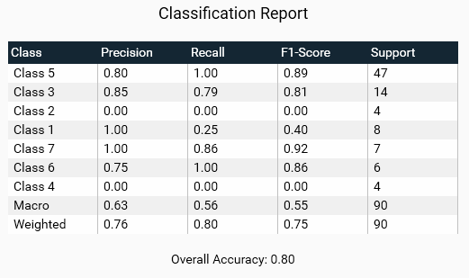
Good: High precision, recall, and F1-scores across all classes indicate a well-performing model. Consistent support across classes ensures that metrics are reliable.
Bad: Low precision or recall for any class suggests poor performance. Disparities in support may indicate class imbalance, which can affect the reliability of the metrics.
Overall Accuracy
The overall accuracy of the model is the ratio of correctly predicted instances to the total instances. It provides a single metric to summarize the performance of the model across all classes.
Good: High overall accuracy indicates that the model performs well across all classes.
Bad: Low overall accuracy suggests that the model may not be generalizing well and could require further tuning or a different approach.
Steps to Improve Training
Identify and address the outliers in your training data. This may involve removing incorrect samples or correcting the labels of misclassified samples.
Add more training samples to ensure that the model has enough data to learn from. A larger dataset can help the model generalize better and reduce the impact of noise. Check the confusion matrix to identify classes with low support or high misclassification rates, and consider adding more samples for those classes.
Adjust the hyperparameters of your training algorithm to better capture the underlying data distribution. This may involve changing the learning rate, batch size, or other parameters.