One-Class Classification: Interpreting Training Quality Charts
This guide helps you interpret the performance of your model training using:
Jackknife Quality Control Index Values
Hodges-Lehmann Null Distribution
For details on the quality control methods used, refer to the section on Quality Control in Machine Learning Models.
By examining these visual and statistical diagnostics, you can distinguish between well-trained (good) and poorly trained (bad) models.
Interpretation of the Charts
Histogram and Kernel Density Estimate (KDE)
The blue bars represent the histogram of the data, showing the frequency of different quality control index values.
The green line represents the Kernel Density Estimate (KDE), which smooths the histogram to give a continuous estimate of the data distribution.
Jackknife Quality Control Index Values
These charts show the distribution of quality control index values. The x-axis represents the quality control index values, and the y-axis represents the frequency of these values.
A well-trained model should have a distribution that is tightly clustered around a central value, indicating consistent quality.
Hodges-Lehmann Null Distribution
These charts show the null distribution of the Hodges-Lehmann statistic, which is used to test the hypothesis that the quality control index values come from a specified distribution.
The red shaded area represents the threshold beyond which values are considered outliers. This threshold is typically determined by statistical methods to identify values that deviate significantly from the expected distribution.
Identifying Poor Training
Presence of Outliers
Outliers are data points that fall outside the expected range of values. In your charts, these are represented by the bars that extend into the red shaded area.
A high number of outliers suggests that the training data contains many samples that do not conform to the expected pattern, which can negatively impact the training process.
Distribution Shape
A good training process should result in a distribution that is symmetric and tightly clustered around a central value. If the distribution is skewed or has multiple peaks, it may indicate issues with the training data or process.
In the provided charts, the presence of multiple peaks or a skewed distribution suggests variability in the quality control index values, which may indicate inconsistent training quality.
Comparison with Expected Distribution
Compare the histogram of your data with the KDE line. If there are significant deviations between the histogram and the KDE, it may indicate that the training process is not capturing the underlying data distribution well.
Cross-validation
Cross-validation is a technique used to assess the generalization performance of a model. It is already integrated into the training process, where the model is trained on different subsets of the data and evaluated on the remaining samples. This helps to ensure that the model is not overfitting to a specific subset of the data.
But it is always a good practice to do manual cross-validation to further validate the model’s performance. This can be done by splitting the reference dataset into training and validation sets, training the model on the training set, and evaluating it on the validation set. The validation set is simply several instances of the reference class let in the Unclassified class, which is not used during training. This allows you to assess the model’s performance on unseen data and ensure that it generalizes well.
Steps to Improve Training
Identify and address the outliers in your training data. This may involve removing incorrect samples or correcting the labels of misclassified samples.
Add more training samples to ensure that the model has enough data to learn from. A larger dataset can help the model generalize better and reduce the impact of noise.
Adjust the hyperparameters of your training algorithm to better capture the underlying data distribution. This may involve changing the learning rate, batch size, or other parameters.
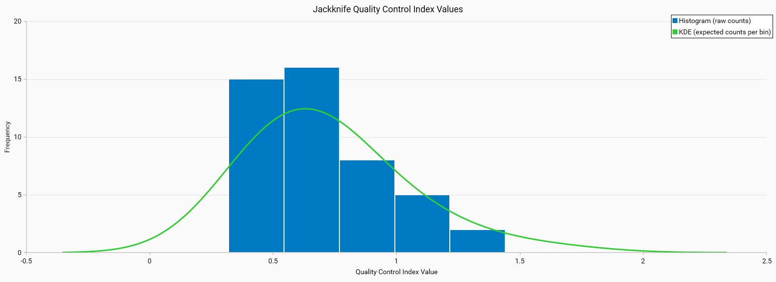
Good Training Example
Jackknife QC Index (Good)
Histogram Characteristics: The histogram is narrow and centered, indicating that most QC values are tightly clustered around a central value.
KDE: The green line is bell-shaped and closely follows the histogram, suggesting a good fit to the data.
Interpretation: This tight clustering suggests that the model generalizes well across different resampling iterations, indicating a robust and reliable model.
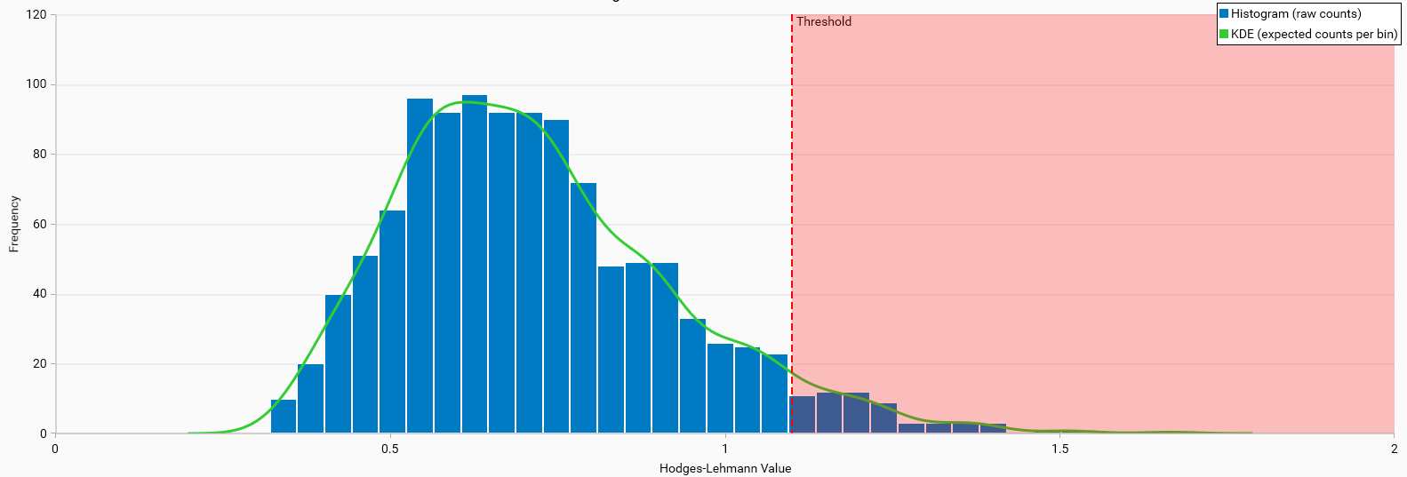
Hodges-Lehmann Null Distribution (Good)
Histogram Characteristics: The histogram shows a distribution of Hodges-Lehmann values that is tightly clustered around a central peak. This indicates a consistent and reliable dataset.
KDE Line: The green KDE line fits well with the histogram, suggesting that the expected distribution aligns closely with the observed data.
Threshold: The confidence limit value applied to the data, the shaded red area represents the threshold beyond which values are considered outliers. It does not indicate any training quality issues.
Interpretation: The narrow confidence limits and well-fitted KDE line suggest that the model’s performance is statistically significant and reliable.
Bad Training Example
Jackknife QC Index (Bad)
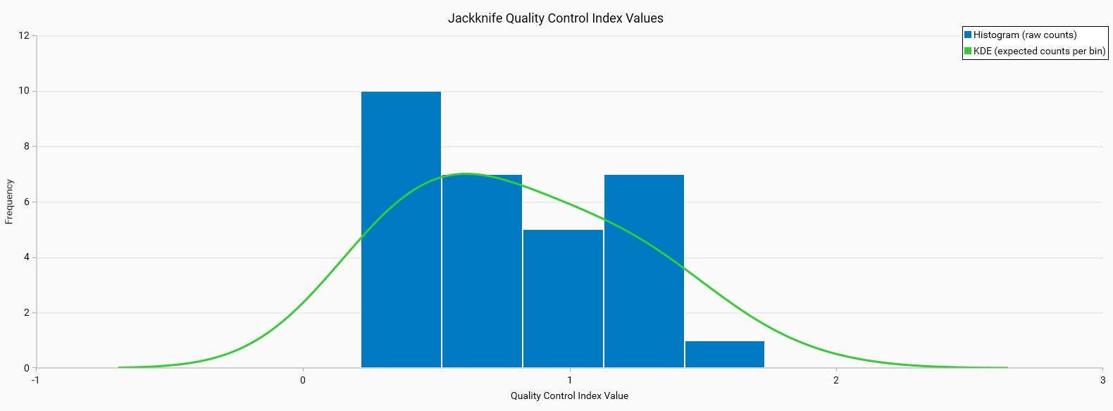
Histogram Characteristics: The histogram is broad and possibly skewed, showing high variability in QC values across different folds.
KDE: The green line is flat and does not follow the histogram well, or has an asymmetric shape, indicating a poor fit to the data.
Interpretation: This variability indicates instability in the model, which could be due to overfitting or insufficient training data.
Hodges-Lehmann Null Distribution (Bad)
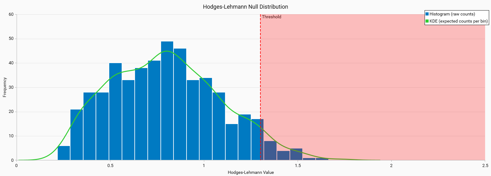
Histogram Characteristics: The histogram shows a broader and possibly skewed distribution of Hodges-Lehmann values. This indicates variability and potential inconsistency in the dataset.
KDE Line: The green KDE line may not fit as well with the histogram, suggesting discrepancies between the expected and observed distributions.
Threshold: The confidence limit value applied to the data, the shaded red area represents the threshold beyond which values are considered outliers. It does not indicate any training quality issues.
Interpretation: The wider confidence limits and less well-fitted KDE line suggest that the model’s performance may not be statistically significant and could be due to chance.